
Every image on this site is generated. The Victorian cat heroes, the OG cards, the square crops for socials, all of it. We covered the basics back in 2023 and that walkthrough is still up and still correct, but it only covers the standard 1200x630 unfurl card, because back then that was pretty much all anyone asked for. That stopped being true a while ago. A link unfurl wants 1200x630, an Instagram feed post wants 1080x1350, a square crop wants 1080x1080, and I'm really not going to hand-design three versions of every hero image for every post we publish, that's what the template is for.
So this is the 2026 version of that post, where the same Satori template renders all three sizes from the one route. Everything below comes straight out of turbo-start-sanity (opens in new tab), our open-source Next.js and Sanity starter, so you can just rip it off and use it in your own project. We ran all the renders and benchmarks ourselves while writing this.
The template already takes width and height
turbo-start-sanity ships an OG route at apps/web/src/app/api/og/route.tsx. It fetches the page's SEO data from Sanity and serves the editor's dedicated share image if they uploaded one. Otherwise it falls back to a generated card with a dark background, the site title top left, a type pill for blog posts, and the page title in 76px Inter pinned to the bottom.
The bit I think most people miss is in og-config.ts, because the route already accepts dimension overrides from the query string.
So /api/og?type=blog&id=...&width=1080&height=1080 renders today, unmodified. We put a live copy of this exact template at our OG image generator if you want to have a play without cloning anything. The problem is that raw width and height params leave you with a 76px headline floating in a 1080x1080 square, with padding that was designed for a landscape card. It looks lost. So most of the work here is getting one template to look right at every size.
Adding the ratio presets
First, swap the free-form dimensions for named presets. I'm a bit paranoid about the free-form version, because anyone with the URL can request a 4000x4000 render on your compute. With presets the route will only render the three sizes we've actually defined, and each preset carries the label that ends up in the footer.
Then the template itself. Rather than trying to scale one landscape layout up and down, we made the title do all the visual work, so uppercase lines packed tight and anchored to the bottom of the canvas, the quoted word on an inline white highlight, and the width and height stamped in the footer.
There are two magic numbers in here, and both of them took a fair bit of trial and error. The first one, CHAR_W at 0.72, is the average advance width of Inter ExtraBold uppercase as a fraction of the font size, which we measured against real renders after 0.6 clipped. Dividing the inner width by a line's character count times that number sizes the line to span the canvas. The second is a packed-height fit, which stops the title stack shoving the footer off the squatter canvases. Every line then shares one size and one gap, so the rhythm stays the same across all three ratios.
The targetLines calculation is doing more than it looks like, because it's the reason the same template works at all three sizes. The wide OG card groups the title into two or three long lines, the square and portrait cards break it into four short ones, and the stack always sits flush against the footer with the leftover space above it. Nothing about a specific canvas is hardcoded.
Those two plain divs with height: 4 are standing in for border rules, because a real CSS border took the whole process down when we tried it. There's a stack trace waiting for you further down, in the section on what's bitten us.
The GET handler needs two lines changed to thread the dimensions through.
The Sanity fetch layer doesn't need touching at all, because the data doesn't care what shape the canvas is. og-data.ts still pulls SEO data through sanityFetch inside "use cache", and the sync-tag webhook still revalidates it.
What it renders
Here's what comes out of the code above at each of the three sizes, rasterized at 2x so the type stays sharp on retina screens. On the resvg side that's fitTo: { mode: "width", value: width * 2 }, and if you're using ImageResponse you get the same effect by doubling the option dimensions.
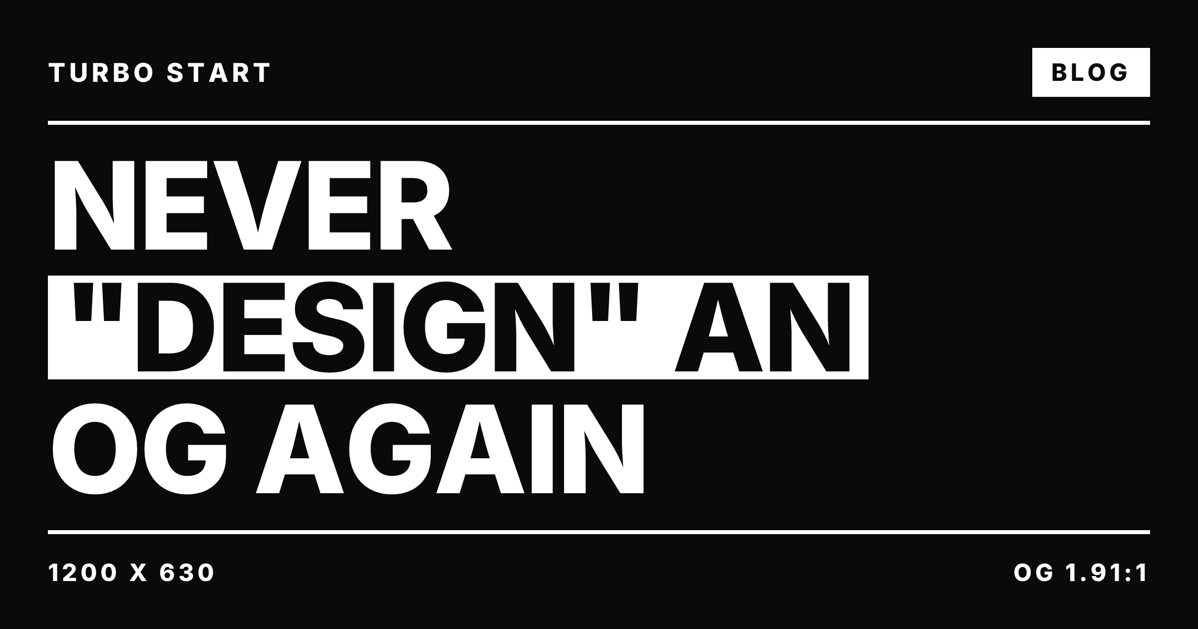
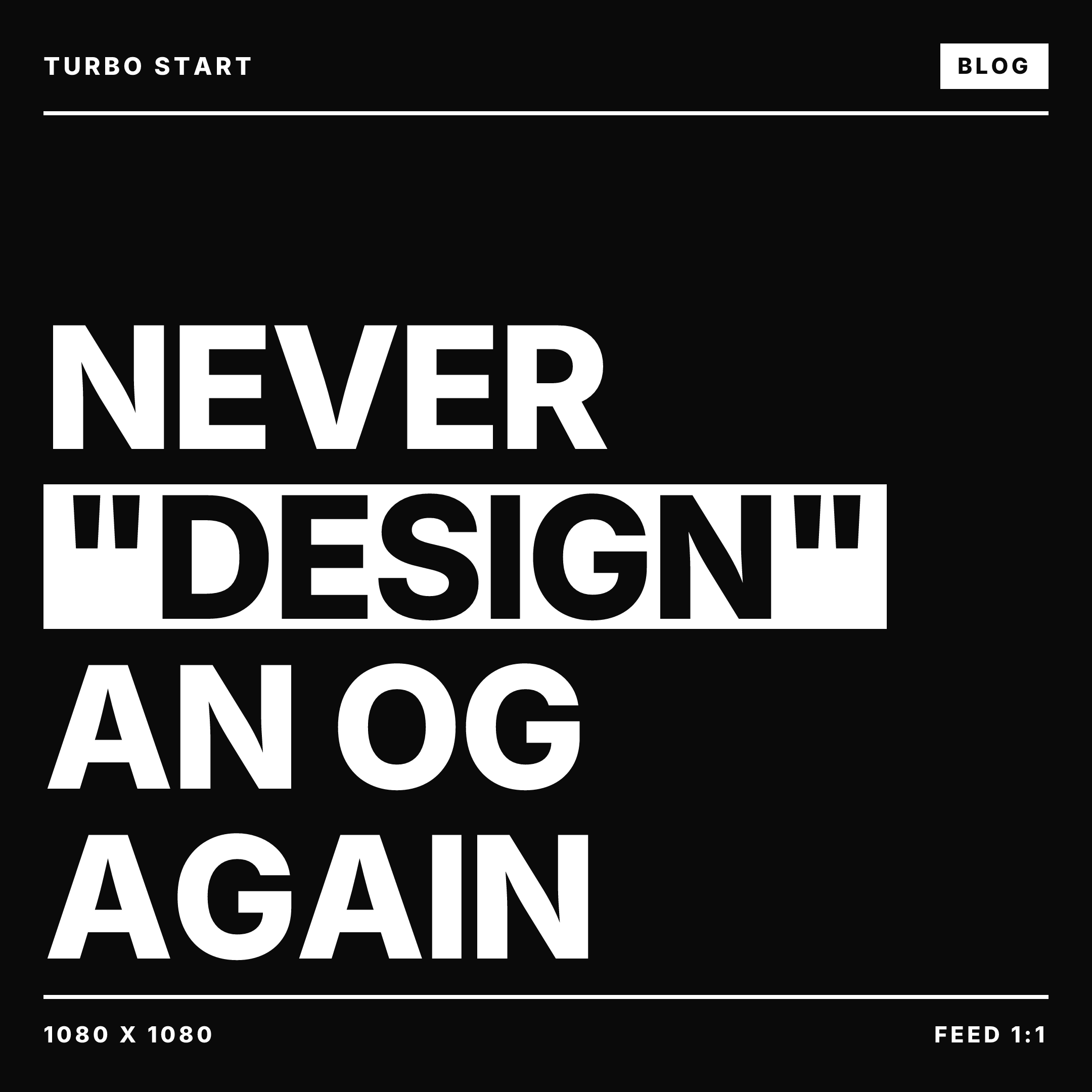
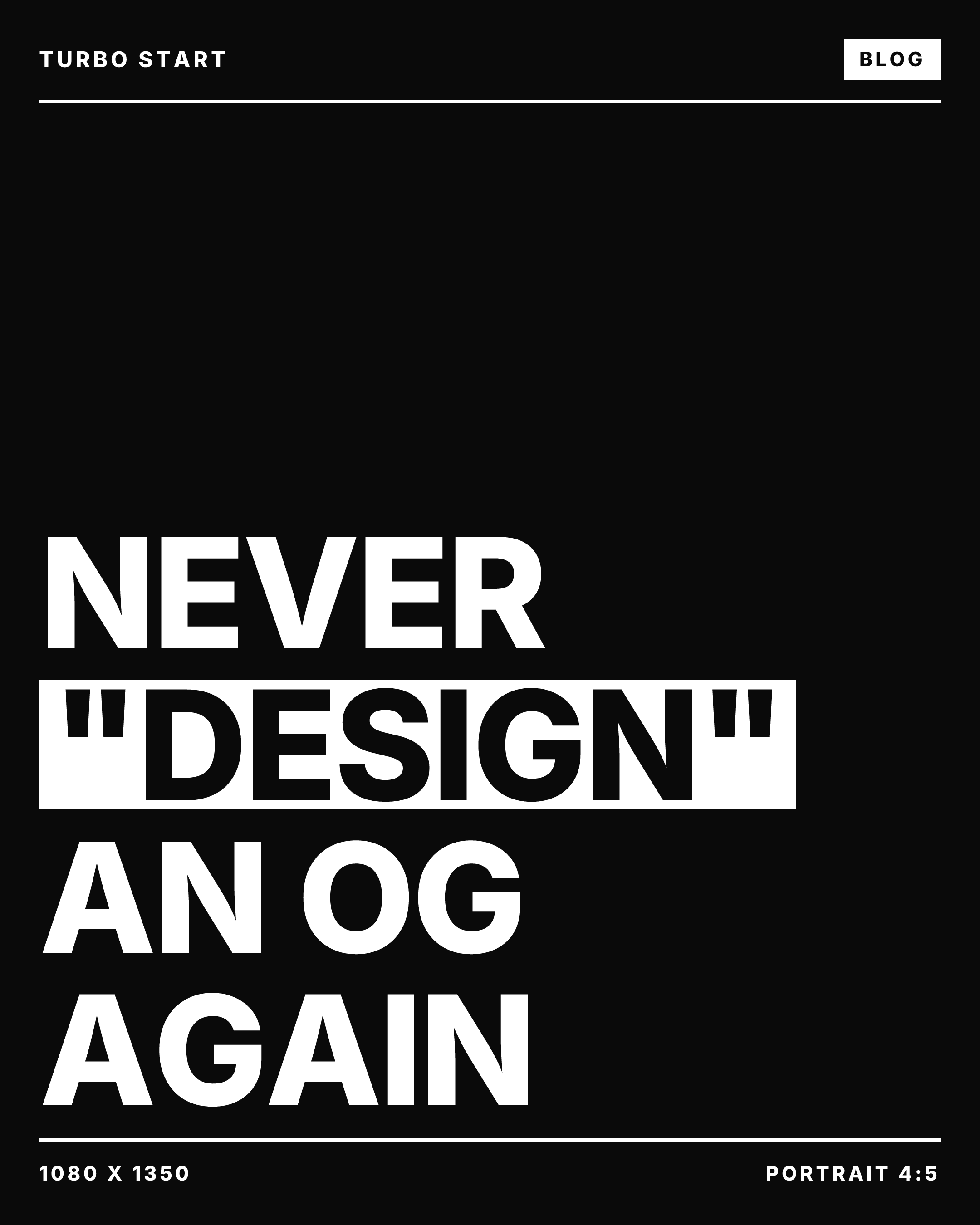
You can see the wide one grouped the title into longer lines than the tall two, because targetLines aims for fewer, longer lines on a wide canvas. And I think the footer stamp is the best bit of the card, because once you've got several exports of one post sitting in a folder, the file tells you what it is before you upload it anywhere.
What it costs
We benchmarked both halves, so the raw Satori and resvg pipeline locally, and this site's production OG route over the network, which runs the same architecture and the same ImageResponse.
| Measurement | Cold | Warm |
|---|---|---|
| Satori layout (per ratio) | 33ms | 2ms |
| resvg rasterization at 1x (per ratio) | 901ms | 54 to 56ms |
| resvg rasterization at 2x (per ratio) | 124 to 126ms | |
| Production route, fresh render with remote image fetch | 1.9s | 1.1s |
| Production route, CDN-cached repeat | ~100ms | |
| PNG output size (2x) | 77 to 149KB |
Drawing the pixels is cheap. Layout is single-digit milliseconds once the fonts are loaded, and a warm 1x rasterize costs about 55ms. The expensive bit of a fresh render is fetching fonts and remote images, and that's why a fresh production render that pulls a hero image off storage takes about a second. So the cache header is the only setting here I'd bother arguing about. Our route ships Cache-Control: public, max-age=31536000, immutable, so any given image renders roughly once, ever, and every crawler after that gets the CDN copy in about 100ms.
Everything that's bitten us
We've been running this setup in production for years now, and it's bitten us a fair few times. Roughly in the order it happened.
Satori only does flexbox. No grid, no float. The tw prop is a Tailwind-flavored shorthand rather than actual Tailwind, and colors have to be hex or rgb, because oklch and hsla render wrong without erroring. Our design tokens are oklch, so we convert at the template boundary.
Every font weight is a separate fetch. Satori inherits nothing from the system. The Google Fonts trick in the template works, where you request the CSS with a Firefox/1.0 user agent to force a non-variable TTF, regex out the URL, and fetch the binary, but it runs on every uncached render. For fonts you control, I'd just vendor the files and read them from disk.
Allowlist your image hosts. If the route accepts an image query param and passes it to an <img> in the template, you've built a free proxy that'll fetch any URL on your infrastructure. Ours checks the hostname against an allowlist of exactly two hosts before Satori is allowed to fetch anything.
Only ever emit one og:image. It's tempting to put all three ratios in the metadata and let the platforms choose, but they'll all pick different ones, and your LinkedIn preview ends up being the square one cropped to landscape. We emit the single 1200x630 image in the page metadata, and the square and portrait URLs are just there for humans and tooling to fetch when they need that specific asset.
A CSS border can crash the rasterizer. The first version of this card used borderBottom with a solid white line for the header rule. Satori renders borders as path arcs, and with no border radius those arcs come out zero-radius, which panics resvg 2.6.2 outright, a Rust unwrap() on None in geom.rs that takes the whole process down. That's why the template above uses flat divs for the rules. If your route ever dies with a rasterizer panic instead of an error, diff the SVG for zero-radius arcs.
There's no text stroke. We tried outlined type for the alternating lines first, but Satori doesn't support -webkit-text-stroke and doesn't error either, it just emitted a 332-byte SVG with the text gone. The inverted white bars in the final design started life as that fallback, and I think they ended up better than the outline would have been.
iMessage was the one that really got us. Our site-wide default OG image is an animated GIF, which turned out to mean Apple's LinkPresentation framework shows only its first frame. The fix that survived testing was shipping an og:video mp4 twin alongside the static image, and we only found any of this by testing on an actual phone, because none of the validator tools caught it.
Peeling the AI label off your AI slop
Hilton Lee's guide on the Sanity Exchange (opens in new tab) covers a failure mode I hadn't thought about at all. Your images live in Sanity, they render fine on the site, and then someone downloads one to post natively on Instagram and the platform slaps an AI label on it, because the platform isn't looking at the pixels, it's reading the metadata that's still sitting inside the file.
AI tooling signs everything it makes. OpenAI's image models embed C2PA provenance manifests, Google's embed SynthID plus IPTC metadata, and Photoshop writes Content Credentials the moment Generative Fill touches a layer. Even Lightroom's AI Denoise gets flagged in some pipelines, which feels a bit much. And Sanity's image CDN only transforms pixels, so width and format and quality and focal point, it has no opinion about file-level provenance, which means the metadata rides along through your whole stack and announces itself at any platform that reads it. LinkedIn already renders C2PA as a visible credential on posts.
We are, to be clear, exactly the audience for this warning. Every hero image on this blog is a gpt-image-2 render of a Victorian cat, and my LinkedIn headshot, cheeky smile and all, was shot in the office and then hi-key edited with nano banana. I'd rather the file didn't go around announcing that, but announcing it is basically the entire point of the metadata.
I'd adopt Hilton Lee's workflow wholesale here. Keep the high-quality master in Sanity with its provenance intact, because provenance in your archive is a feature. When an image is headed for a native social upload, export it, check what it's carrying, and strip the C2PA and XMP blocks locally with a browser-based tool like removeailabel.com (opens in new tab), so the file never leaves your machine. Upload the cleaned copy and keep the master. Then write the process down in the Studio where your editors will actually see it, because the person doing the Instagram post is probably not the person who read this blog.
Whether provenance labels are good for the ecosystem is a separate argument, and I think they probably are. But an AI badge appearing on a client's brand account because nobody checked the file first isn't part of that argument, that's just a missing checklist step.
When to render and when to pre-generate
The route above renders at request time, and for link unfurls I think that's the right default, because crawlers hit URLs you can't predict, the immutable cache means each image only renders once, and there's no publish-time step to forget.
For images humans re-upload, so the Instagram export, the newsletter header, the scheduling tool asset, we pre-generate at publish time and store the files instead. This site's pipeline writes three variants to storage for every post the moment it's created, and the post just references them as plain URLs. A stored file has a stable URL, survives a framework migration, and goes through the metadata-stripping step above exactly once instead of on every download.
Screenshotting your own pages with a headless browser is the third option, and I wouldn't bother, because a template only changes when you change it, whereas a screenshot redraws your social cards every time anyone touches the page it points at.
No spam, only good stuff
Get the next one


The multi-ratio pattern lives in this post rather than the template for now, and if enough people lift it we'll PR it into turbo-start-sanity (opens in new tab) properly. If you're starting from zero, the 2023 post covers the single-ratio setup, and the template ships the working route today.