


If you've ever worked with page builders and padding, or worse-still, user defined padding, you'll know why we wrote this. I'm going to start with a trip down memory lane, and later on, get into the technical, so if you're a dev, you'll probably want to skip the first section, or stay along for the ride.
Standard spacing rule system
Ever wondered why we often use 8px inside design? Well, there isn't really a definitive reason, but I'm going to tell you why we harp on so much about it. It's because we design most websites for desktop. Yes, I know there was that whole "design for mobile first", but go walk over to your design team, ask them to show you a wireframe for your website, and I'll bet dollars to donuts they don't show you a mobile wireframe first.
So why desktop then? Well, as you probably know, most monitors aren't 4:3 anymore, they're nearly all 16:9, unless you're one of those weird "gamers" who have to go and get a 21:9 monitor and break the whole pattern. You know the interesting thing about 16:9 - it's divisible by 8. Why is that important? Well, it means you're never going to get a blurry line if you put a line on a whole pixel. Let's not get into sub-pixel rendering, because that's a whole different ball game. Let's go from here on out and assume 8px is the best, and people who use 10px in their designs should get replaced by AI, sooner than later.
Another handy part of using an 8px grid, or more specifically, moving onto Tailwind CSS default setup, is that we can very easily work out visual rhythm, do you want something to be double the distance from X to Y? Well you just double the number.
Why is visual rhythm important? Well, let me show you:
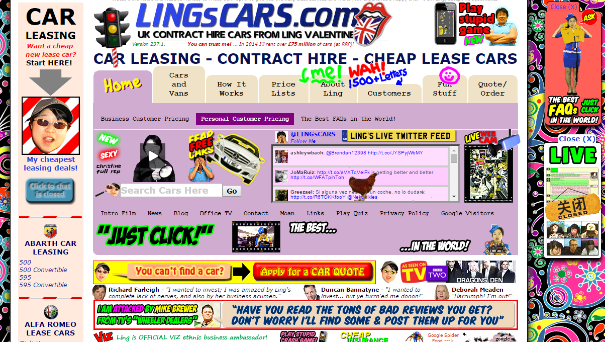 Old Ling's cars
This is Ling's cars. Funnily enough, this website didn't convert well because it lacks rhythm. The content looks as though somebody accidentally kicked over a LEGO box and I personally thought it was a joke website (and younger me nearly ended up leasing a car).
Here's what it looks like today
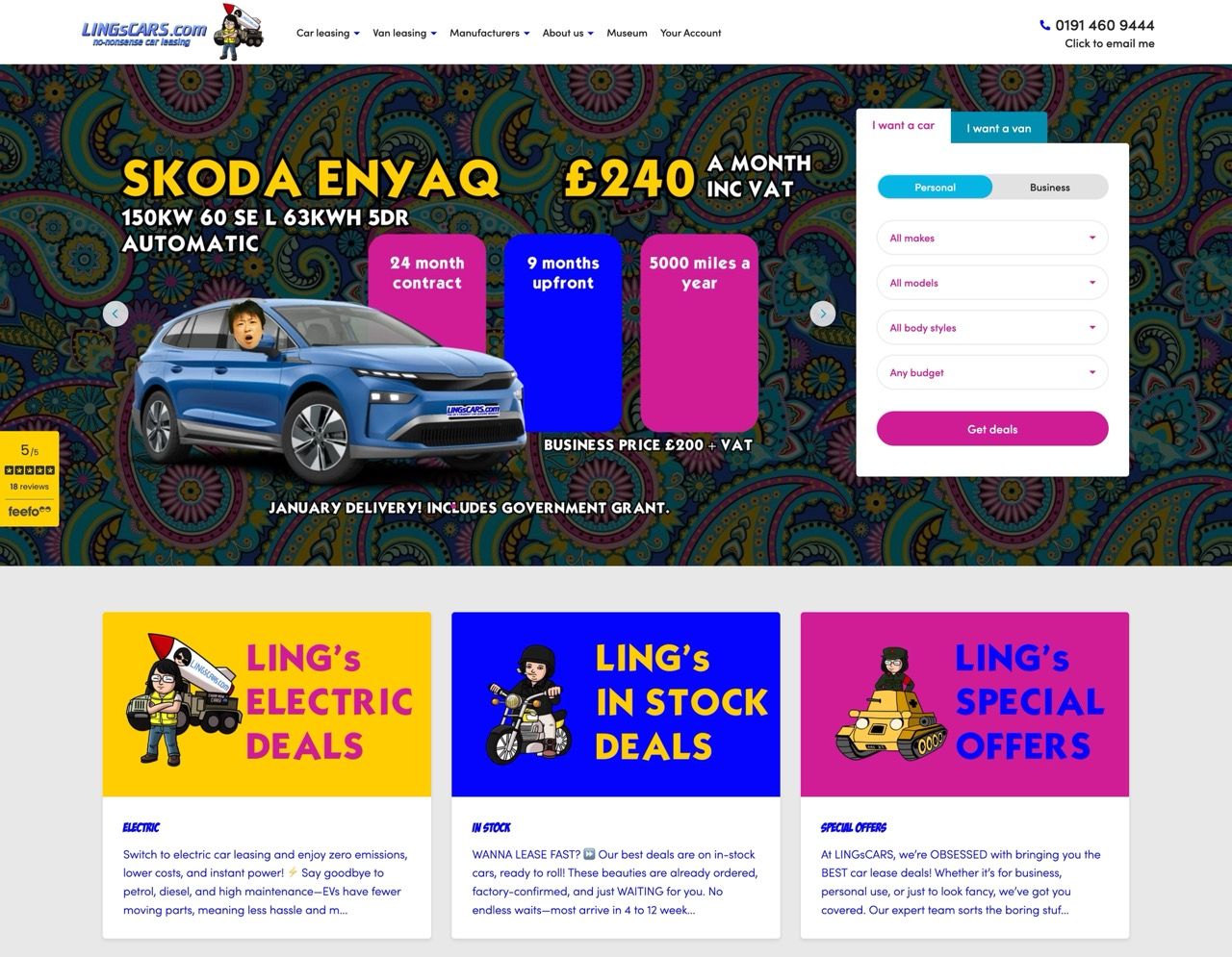 Ling's cars today
Yes, boring, I know. However, there is a good reason it resembles all the other websites on the internet. It's because we're used to this rhythm. We start at the left and work our way across in a Z pattern.
One more part of understanding of visual rhythm is not screwing up the way you code page builders. Have you ever seen a conditional in JavaScript before? Well this little baby is going to save you from having varying spacing, and as a bonus, it's basically necessary if you don't want to break your preview with Next/Image.
With the above, if you don't have a title. You won't have the space and the margin bottom where that <h1> would have ultimately been. This is especially important when working with live previews. So heed my advice - most, if not all, of your string content should be rendered in a similar manner to the above code.
One last thing for those of you old enough to have remembered the glory days of using Bootstrap: base 8 works wonderfully with a 12-column grid. Now, if you use a 12-column grid in this day and age, there's something very wrong with your layouts... But at least it's nice to share that blast from the past.
Never, ever, allow user-defined padding
Want to know the best way to ruin my day? User-defined padding. If you so much as utter this word, I feel the vein in my forehead ready to burst
 User-defined padding nearly pushing me over the edge
Why would somebody be so upset over pixels you might ask? Well it's probably because once you add this god-foresaken functionality into your page builder, you will never know the concept of consistency ever again.
It all starts with something looking slightly off in a pagebuilder layout, and quickly spirals out of control until everything is 32px on the bottom, 72px on the top, and for some reason 12px on the right, overflowing.
Believe me when I tell you this: we've seen folks change their website design three times. First with a colorful, brand-focused look, then with mostly white backgrounds, and finally with dark backgrounds.
As you might imagine, by the time it was finished, there was black and white everywhere, with occasional pops of red... Like a penguin in a traffic accident. Guess what the next question was to resolve this?
Can we add padding to our page builders?
But we really want user-defined padding
So you ignored everything I said above and still wanted it anyway. That's fine, that's ok. I'll spell it out passive-aggressively for this next paragraph.
If you absolutely have to do this you will want to ensure you're using pre-defined strings... never number inputs.
Here's the Sanity side of things
And here's the component side of things
(or you'd never know this pain if you just used our workshops)
So how do I do it correctly?
You'd be wrong in thinking we haven't already looked into finding the best solution for this. We've spent days and weeks testing this across a range of projects, and the simplest way of making sure this never happens is to simply add a pagebuilder value inside of Tailwind CSS and never break convention.
Here's how you can do it for Tailwind CSS v3
Or if you're using the latest Tailwind CSS v4
So now you've got this, how do we use this for a page-builder block? Well, it's pretty simple. Here's how you would apply it to a regular page builder block.
But as with anything padding-related, there's always a curveball. How do we handle page builder blocks when there's a background image, because then it's going to be flush to the block next to it? Well, that's nice and easy, we double the number of py-pagebuilder classes and add an additional div.
Again, you'll probably want to use py-pagebuilder or my-pagebuilder, depending on how you want to display your background image. You can figure that bit out; we're not going to spoon-feed you the whole way, or we wouldn't be in business.
No spam, only good stuff
Subscribe, for more hot takes
Wait, the client just said the blocks are too close together
Thank goodness, we built this whole spacing the way we did. Otherwise, we'd probably have to do a monster find-and-replace and break something as part of the process.
Because we set a global variant for this page-builder spacing, we can simply go ahead and change one value, and it will permeate throughout the entire project.
What if I already screwed this up and built my project
Oh, didn't you know? We inherit way over half of the projects we maintain. Why do you think I put so much vitriol into these blogs? It's the only way I can vent after seeing the average agencies' code quality. Let me give you the quick-fire process with the help of AI.
Basically, you have to be careful of context windows, because that's what you'll be battling with as we have to migrate 20+ page builder blocks. So how do we handle that?
Use a markdown file to keep your AI agent in check.
Remember to read through the migration script to ensure you haven't missed anything you want to achieve. The one above is a simple template and needs a little tweaking specific to your project.
Closing notes
The reason we get so flabbergasted by this kind of issue is that it's so avoidable, and effectively the only person that loses is the client, if you build it incorrectly. Oh, and obviously us, when we inherit it and have to fix it.
That being said, we want you to succeed, so if you're looking at building a solid page builder, we always advise the same thing. Take our Turbo Start Sanity template, and read an opinionated guide to Sanity studio. You'll get more than enough information about how to structure everything. If you're still struggling, we also wrote a whole Sanity learn course to help with page builders.
If you'd rather just get it done perfectly the first time, you could always just pay us to build it. I heard Roboto Studio is pretty good at building Sanity websites or something. Drop us a message below.